Email Results Reporting Best Reports for Executive Summary

One of the most common client support questions after Black Friday email sending is “What are the best reports to use for a year end Email Program Executive Report?”

Well here are some ideas that may help.

Of course, the Statistical Charts provides a wealth of Executive Summary type information and charts by date range.  Most client results are impressive and this report has a plethora of dat and charts to make the meeting room silent (in a good way). Delivery % decent, Unique opens great!, Unique Clicks great should be your main metrics.

Most clients find these reports most helpful for executive reports in addition to Statistical Charts:

Breakout of Email Clients and Mobile Devices.
Compare Jobs Side by Side
Open and Clicks by Domain Name ** (some nice charts here as well

As far as by domain performance tracking, I like the “Opens and Clicks BY DOMAIN” report.

If not, you can also try the “Export Subscriber Interactions by Date Range” report to research open and clicks by subscriber and then sort ALL subscribers by domain names if you wish by exporting report.

I also use the Email Tracking Report, click on the tab I want and search specific domain terms such as @gmail.com, etc.  Count results are in the bottom right corner.

There are over 25 reports and variations in the White Cloud system so report away and make that e-Team happy.

Reminder that our eMail Networks team provides hourly and project consulting to improve you email results as well.

We have our 50 point eMail Networks Email Score Card ™ that takes snapshot of your email program status.  Call us to schedule today.

How to Size Ads for Website and Email Campaigns

Ad Image Sizing Suggestions for your Website and Email Ad Campaigns

Ready to do some on-line or in email ads?  Call us for assistance.  Here is some information to get your project started.

The standard “acceptable file” formats: .GIF, .JPG, .JPEG, .PNG  Suggested file size limits: 150 KB or less for all files.

Standard ad sizes for static ad images:

250 x 250 square ad

This ad size can appear at the top, on the side, or on the bottom of the page.

200 x 200 small square ad

This ad size can appear at the top, on the side, or on the bottom of the page.

468 x 60 banner ad

This ad size can appear at the top, in the middle, or on the bottom of the page.

728 x 90 leaderboard ad

This ad size can appear at the top, in the middle, or on the bottom of the page.

300 x 250 inline rectangle ad

This ad size can appear at the top, on the side, or on the bottom of the page.

336 x 280 large rectangle ad

This ad size can appear at the top, on the side, or on the bottom of the page.

120 x 600 skyscraper ad

This ad size can appear on either the left or right side of the page.

160 x 600 wide skyscraper ad

This ad size can appear on either the left or right side of the page.

300 x 600 half-page ad

970 x 90 large leaderboard ad

Contact us at (866) 271-5908 or www.eMailNetworks.com for more information.

Increase Your Instagram Engagement

How Businesses Can Get More Engagement on Instagram Instagram is definitely the place for pictures. So if your business is a photography studio you should have joined Instagram long back! But, Instagram is not just about who has the best photography it is an awesome way to showcase your brand, tell your story and interact […]

Email Bounce Code List for eMarketers

The most commonly used bounce codes are noted in bold below:

0    Unknown
2    Email Send Error
10    Email address is invalid or not active, no such mailbox exists
20    General Soft Bounce
21    Soft Bounce – DNS Failure
22    Mailbox Full
23    Message Too Large for mailbox recipient
24    Response timed out from destination mail server
25    Message Quarantined
26    Message was flagged due to characteristics of spam
27    Firewall issues on the desitnation mail server prevented this message from being delivered
28    Mail server refused connection
30    Email address is invalid or not active, no such mailbox exists
40    Destination mail service problems
50    Message was flagged due to characteristics of spam
51    Spam
52    Message was flagged due to characteristics of spam (Content)
53    Mail blocked due to attachment
54    Destination mail server does not allow relays, mailbox is most likely incorrect
55    Mail server requires more information on senders domain
60    Auto Reply response detected (e.g. out of office)
110    Mail server requires confirmation
501    rejected due to configuration issues with remote host
502    bounced due to bad connection issues with remote host
503    refused or blocked due to content related reasons
504    bounced due to not being delivered before the bounce-after
505    bounces due to receiving no response from remote host after connecting
506    rejected due to other reasons
507    refused or blocked due to general policy reasons
508    rejected due to SMTP protocol syntax or sequence errors
509    rejected or blocked due to mailbox quota issues
510    refused or blocked due to remote mail server relaying issues
511    bounced due to mail routing issues for recipient domain
512    refused or blocked due to spam related reasons
513    refused or blocked due to virus related reasons
514    Invalid Sender, might require pre-authorization
550    General Send Error
1000    bounced due to invalid or non-existing domains
1001    rejected due to expired, inactive, or disabled recipient addresses
1002    rejected due to bad, invalid, or non-existent recipient addresses
1100    rejected due to bad, invalid, or non-existent recipient addresses

Call our client support line at (866) 271-5908 with any questions.

HTML Email Design Guidelines

Email Layout Guidelines

When designing your own template, please keep the following specifications in mind:

  • Designed HTML email templates should not be wider than 700 pixels. Many email programs are unable to display wider templates properly.
  • Use basic HTML 4.0 when customizing your own email message. The following are discouraged: scripting, embeds, frames/iframes, image maps, and attachments (i.e. no important content in images only).
  • Table layout is heavily preferred over using Cascading Style Sheets, which some email clients ignore.  Nested tables and advanced formatting such as colspans and rowspans can also be used, but using a stacked table structure is recommended. This type of structure is more stable across all email programs. Please test your template by sending it to yourself (using as many different email accounts and email programs as possible) before sending to actual recipients.

Email Formatting

  • Inline style tags can be used to format text, however, using regular HTML font formatting is recommended for guaranteed universal acceptance. External style sheets are prohibited by nearly all email programs. Using inline style tags in the header of your HTML template is also prohibited by most email programs, as HTML emails have no HEAD or BODY tags.
  • JavaScript is prohibited. Most email programs will not accept it.
  • Forms are not recommended, but can be used if the mailing doesn’t include recipients using AOL®, Hotmail®, MSN®, or people who use MS Outlook® 2007. If absolutely necessary, the form should be very basic and not employ JavaScript.
  • Use absolute paths for images. Images should be 72dpi. Define both height and width to prevent distortion of your image. Do not put important content in images only.
  • Flash or other plug-ins should not be used within an email template. If plug-ins are required for your email campaign, consider directing the user to a hosted landing page to view the plug-in content.
  • When designing plain text emails, wrap the text after 65 characters so that it renders well in text-only devices such as PDA’s, BlackBerries®, phones, etc.

Email Content

  • All featured creative like banners, navigation bars and content that has a high priority should appear near the top of your email so that it will be displayed in preview panes, such as in many versions of MS Outlook®. The average measurement for this area extends down to approximately 300 pixels from the top of the email.
  • Featured content should also appear “Above-the-Fold” when using a web-based email program, like Gmail™ and Yahoo!®, so the recipient will not have to scroll down to read more content. The average measurement for this “Above-the-Fold” area is approximately 420 pixels in height starting from the top of the email.
  • The entire template design should be encased in a 1-pixel border. This will “seal-off” the template and present it as a unified design element to the user.
  • Consider adding more organic shapes into your template design. Email creative is usually displayed through applications which have very rigid, box-like layouts. Adding images with people, or designing with curves will make your template visually appealing to attract the recipient’s interest.
  • Make sure that the featured content in your email exists in HTML text, not only images. Most email clients do not display images by default, so the user won’t be able to see any content that’s in an image unless they take action to turn on the images.
  • In order to comply with the CAN-SPAM Act, an unsubscribe link must be available within your email message. Critical Impact will automatically add the required unsubscribe link to your email message before it is sent to your recipients. Be aware that it will be added to the bottom of your template. If you wish to preview your message with the unsubscribe link included, send a test email message to your email account prior to sending it to your contact lists.

Trouble Shooting email problems

  • If you notice strange spacing in Outlook with images, and you use a spacer pixel, make sure the spacer pixel is 10×10 and transparent.  Outlook will only space a 1pixel image 64 pixels over.
  • If images are being resized to their original size in Outlook, you’ll need to save the image with less than 96 dpi resolution or save the image file itself with the dimensions you would like to see in your email message.
  • If “Sliced” pictures are showing incorrectly in gmail or other free email clients (with excess padding) use style=”font-size: 0;” in your table or <center>
  • Also, make sure to use <img src=”#” style=”display:block;”> in your images if you continue to have that problem with gmail or other free email clients
  • Also, Outlook 2013 requires that you add a line-height to the table cell containing the image if the height of the image is small.  For example, <td style=”display block; line-height:10px;”><img … style=”display:block; height:10px;”></td>
  • To remove the “dark blue” border that you see surrounding a hyperlinked image, set the image border=”0″ to hide it
  • If background colors are not appearing properly in some email clients, check to make sure that there are no extra spaces in a bgcolor=”#000000″ tag or use the syntax: style=”background:#000000;”

Email rendering issues and fixes for Outlook Web App (OWA)

  • If extra padding is still added to the bottom on images in Outlook Web App, add this style to the top of the body:
<style type="text/css">/* FIX FOR OWA */
.bdyItmPrt IMG {display:block; !important}
.bdyItmPrt table IMG {display:block; !important}
.bdyItmPrt {  font-size: 0; word-wrap: break-word; }</style>

Text resizing issues on mobile (iOS) devices

  • If text is being resized on iPhones or iPads, add this style to the header of the email to prevent iOS from resizing the text
<style type="text/css">
    body {
        -webkit-text-size-adjust: 100%;
        -ms-text-size-adjust:none;
    }
</style>

Create Bullet Proof Image Padding

Is your email message text wrapping too closely to your image?

If you so, you might need to make some small formatting adjustments to get just the right amount of white space between text and images.  A lot of email marketers rely on “image padding” in the HTML code to accomplish thisThe problem is that image padding will be ignored by Outlook. So, how do you get additional white space, or image padding between your images and your text?  Here are two quick and easy options.

Option 1:  Add 10 or 20 pixels of white border around the edges of your images before uploading them.

Option 2:  Create a “1 row x 2 column table” within your content that will hold the image in one column, and the content in the other.  Here’s an example:

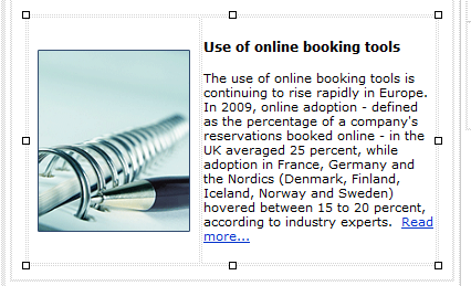
Here’s what my email looked like before I added a table. Notice there is no white-space between the image and the content.

Add a table by selecting a location in the message content, and then clicking on the Insert Table button.  In this example, we are going to insert a 1 row by 2 column table.

Next, enter (or drag) your content (image and text) into the table cells. Place the image in one cell, and the text in another.

Finally, right click on the image and add padding around the edges of the image by adjusting the Hspace (horizontal space) and Vspace (vertical space) fields to achieve the desired amount of padding.


Here’s what the email looks like after placing the image in the left column and the text in the right:

imageWithPadding

Tips for Consistent Paragraph Spacing in Your Email Templates

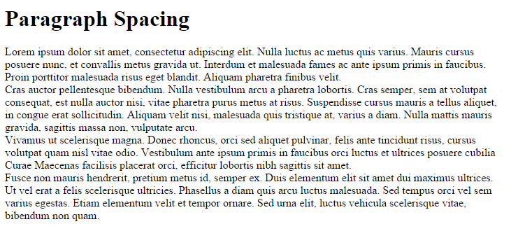
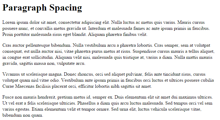
The amount of white space between paragraphs can change depending on the email client (Yahoo, Gmail, Outlook, etc) where the email is viewed. Yahoo will take out all paragraph spacing while Outlook will add more spacing (see screenshots below). To ensure consistent display across email clients, we recommend adding line-height or paragraph margin styles to your HTML email.

Examples of Spacing Issues in Two Major Email Clients

Yahoo Mail (Yahoo removes all paragraph spacing example)

yahoo-before

Outlook.com (Outlook.com adds extra spacing to the LINE-HEIGHT property within a block of text example)

outlook-before

The Solution

To have the paragraph spacing look consistent in email clients, we recommend adding the following styles. Since outlook.com and mail.yahoo.com display CSS from the HEAD element of an email message, you can use embedded and inline styles to remove the default spacing.

1) Add this style to the header of your HTML, inside the <head></head> tags:

<styletype="text/css”">
    .ExternalClass * {line-height: 100%} /* FIX FOR LINE-HEIGHT OUTLOOK.COM */
    p { margin-bottom: 1em; }
</style>

2) Alternatively, add this inline style to each of your paragraph tags

<p style="margin-bottom: 1em; line-height: 100%;"

Creating, Sending And Tracking An Email Is Easy with Email Networks

Create A New Email Message

 You can create an email by selecting a preexisting template and customizing it, selecting a custom made template, or creating a blank email and customizing it.

How to use your own custom HTML to create an email

To create a blank email:

  1. Click the Messages folder
  2. Click Create New Message
  3. Click Blank Email to create an email from scratch
  4. OR click Paste in Your Code if you want to directly paste your HTML code into the editor.
    1. To preview your email in the WYSIWYG editor after pasting in your HTML code, click Source
  5. Click Save

Insert Email Content

  1. Type in the Subject and Name of your email
  2. Enter the body of your email in the large box. You can format it using the tools below.
  3. To save your progress, click Save.  Or, when complete, click Save and Close.
  4. To send a test email, click the Send Test Email button.


Familiarize yourself with the basic editor controls:

image2013-6-18 16-23-38


You can edit the email using HTML by clicking on the Source button on the top left of the toolbar.

Spam Report / Link Verification Tool

You can also check the quality of your email to find broken links and check for spam indicators. To do this:

  1. Click Test, then Spam / Link Check. The dialogue box appears letting you know the results of the test. You will receive a spam score based on a scale of 100.

How to Insert an Image into Your Email Message

Use our insert image tool to add an image.

Insert a Custom Field

You can add a new custom field under the subscriber menu area.  Use the add a custom field tool for proper “text” to add.

Insert a link within the body of your email

  1. Highlight the text that you would like to link and then click on the Link icon. image2013-6-18 16-41-24

Send An Email Message

Test Send

Please make sure to test before making a live send.  Different email clients render HTML in different ways, so you’ll want to send yourself test emails before sending a live email message to your subscribers.

To send yourself a test message:

  1. Open the message in the Messages folder
  2. Click the Test button in the top right corner of the message editor
  3. Enter your email address (up to 5 test emails can be sent from this window)
  4. Optional Features
    1. Impersonate Recipient: enter a subscriber’s email address in order to receive this test send as if you were that subscriber.  It will populate the mail merge variables with this subscriber’s information
    2. Add a Note that will be added to the top of the test messages
  5. Click Send

Inbox Preview

Preview your email in 65 combinations of the most popular email clients and mobile devices. Run an Inbox Preview. Contact you account manager if not enabled at support@emailnetworks.com

Send an Email Message

  1. Click the Messages folder in the left-side menu
  2. Click the Message Folder
  3. Click the message you want to send from the list shown on the right
  4. Click the Send Message button
  5. Select the desired “From Name” from the drop-down
  6. Choose the desired list(s) by checking the box(es)
    1. Note: Each subscriber will only receive one copy of an email message, regardless of the number of selected lists that subscriber may be on
    2. Lists are pulled at the time the email is actually sent.  This means that the estimated send size can change if new people are added to the list, subscribers unsubscribe, etc.
  7. Click Send Immediately or select a date and time to send
  8. Optionally edit the Advanced Options by clicking the arrow next to “Advanced Options”: select a Footer or enable Google Analytics™ Link Tracking
  9. Click Next
  10. Check the box to confirm your selections are correct
  11. Click Send Email

Tracking An Email Message

The Email Tracking report displays a summary report for all of the messages that are sent.  This report shows an overview of how an email send performed by displaying opens, clicks, and delivery information.

To view all tracking details for an email send, follow these steps:

  1. Click the Reports Folder
  2. Click Email Tracking
  3. Highlight the email campaign you’re seeking
  4. Click the View Tracking Report button
  5. Download a PDF version of the report by clicking Export
  6. Click the tabs to view and download detailed report information:
    • Unique Opens: lists all subscribers who opened this email and how many times they opened it
    • Links Clicked: lists all links that were clicked and the total number of times the links were clicked
    • All Opens: lists all subscriber opens, organized by date
    • Who Clicked: lists all subscribers who clicked this email and the links they clicked
    • Unsubscribes: lists all subscribers who chose to unsubscribe after reading this message
    • Hard Bounces: lists all email address that could not receive the message due to permanent conditions
      • This typically results when an email address no longer exists or is inactive
    • SoftBounces: lists all email addresses that are valid, but the message couldn’t be delivered most likely due to a temporary encumbrance
  7. If you would like to view a visual representation of where subscribers clicked on a message, click the message once and then click View Click Overlay

Please contact support at (866) 271-5908 or email support@emailnetworks.com for assistance.

Creating Mobile Versions of an Email Message

How to Create a Mobile Version of an Email Message

As more people now regularly view their emails on smart phones and tablets, email rendering on mobile devices has become a crucial part of email marketing success.  Our email system delivers a reduced version of you main email to iPhones and PDA devices unless you create a separate “mobile” version.  The necessity of creating a specific mobile version varies by industry.  Our message editor gives you the option to create both a normal HTML message and a mobile version of your message that will be seen only on mobile devices.

Getting Started

To create a version of your message that will be seen only on mobile devices, open the second tab of the message editor, called Mobile Message. Insert your content into the message editor like you would for the desktop version.

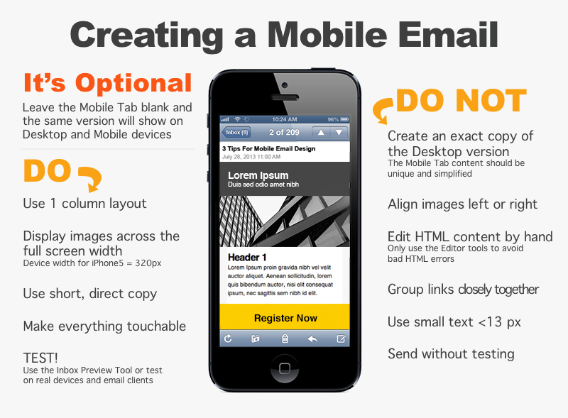
If the Mobile Tab is left blank, the desktop HTML Message will show on desktop and mobile devices.  Only use the Mobile Message tab if you want to create a unique version to make the message easier to read on mobile devices.

If a message is created using a template, that template must have an editable content region set up in the Mobile tab.  Otherwise, the mobile tab will not be editable.

Best Practices

MobileDesignGuidelines7

Copy Content from Desktop Version into the Mobile Version

If you leave the message blank in the Mobile Message tab, mobile devices will receive the email from the HTML Message tab, too. When creating a different version for mobile devices, you can use this option to replace the mobile version with a copy of the desktop version.  To copy the HTML message and paste it into the mobile message:

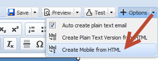
  1. Click the Options button
  2. Click Create Mobile from HTML
    image2013-6-18 12-39-18
  3. Edit the content in the Mobile Tab so that the mobile version is different from the desktop version and click Save

Preview

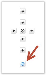
After creating the mobile version, click the refresh icon and navigation arrows to preview approximately how the message will look on an iPhone.  Click the center circle button to center the iPhone preview.

image2013-6-19 17-49-24


Use Template Blocks

Template blocks are a great way to quickly create a mobile message. You’ll be able to insert predesigned templates, layouts, and content regions.

  1. Click the image2013-6-17 16-24-9 icon in the Mobile Message tab message editor toolbar
  2. Select a simple layout or a designed mobile template like shown below:
    mockups
  3. Edit the content and you’ll be ready to go.  Please also review the Mobile Guidelines and Known Issues below.

Mobile Design Guidelines

Mobile Design Layouts

Most of the successful mobile layouts are reduced to a one column layout.  If the desktop version has multiple columns, consider positioning them vertically on top of one another.  The image below shows how you would want to move a left navigation column to the top of the one column mobile layout.


Making it “Touchable”

Since users will be using their fingers to click buttons and links, you should think about making buttons large enough to touch easily.  A good sized click-able area is 44×44 pixels.  If you use a 32×32 pixel image, try to surround it with 12px of padding.

Screen Size

The iPhone 5 has a width of 320px and a screen has to have a width less than 480px to display the mobile message.  Therefore it’s suggested that you use percentages, such as a width of 100%, in order to scale with various mobile devices.

Mobile Message Editor Tips

Image Size

If the estimated iPhone preview shows that the message runs way past the right side of the screen, even after you set the width to 100%, please look at the image sizes in the message.  If they have a width of 600px from your desktop version, resize the images to a smaller width such as 320px.

Background Colors

When a colored background is applied to the body tag of the desktop version, the body of the mobile version will also appear in this color.  To use a different background color for the desktop and mobile versions, don’t put a background color style in the body tag.  Instead, place tables with widths of 100% inside the two versions and add a background color to each table.

Text Handling

Font Size

Some mobile devices resize text automatically.  To prevent this on mobile devices, you can add this to your embedded style:


<style>
* {-webkit-text-size-adjust: none}
</style>


Or you can also control text on a case by case basis by adding the following inline CSS:


<font style="-webkit-text-size-adjust: none">
Example
</font>


Sometimes other devices such as Androids will display text as a slightly different size.  To be safe, make sure that your design is flexible enough to accommodate for a 3% increase or decrease in your font sizing throughout your entire email for optimal results on the Android.


Stop iPhones From Underlining Dates, Phone Numbers, and Addresses

The iPhone will automatically create a link around dates, phone numbers, and addresses in an email message.  To prevent this, add the following style to the header of your email.  Then surround the text with this class.

<!--Place this style in the header-->
<style type=""text/css"">.appleLinksWhite a {color:#ffffff; text-decoration:none;}</style>
<!--Insert this class around the text-->
<span class="appleLinksWhite">TEXT</span>

Known Issues with Mobile and Desktop Emails

Warning: Use caution when creating mobile versions of an email

Since web browsers, email clients, and mobile platforms are constantly changing, the HTML and Mobile versions may appear in unexpected ways.  The media queries used to automatically show or hide the Mobile version will break under certain circumstances.  Do not send a message with a mobile version unless you avoid the known issues listed below and thoroughly test before making a live send.

Here are some known issues with the HTML and Mobile versions, as well as ways to work around them.  We also suggest creating a version of your email in the Mobile Message tab that is very simple to avoid other issues.

Images

When an image in the Mobile tab has an assigned alignment property, it will show below the desktop version when viewed in some email clients like Outlook 2013.

Mobile Image Alignment Issue
<img align="right" ...>

To fix this issue, please take out the align=”right” or align=”left.”  You could also consider making the image appear across the whole width of the mobile device.

Tables

If there is a table in the Mobile tab with multiple rows, but a varying number of cells per row, the table may show.  The height of the table will show as a short block colored with the background color of the table.

In this example, the inner table has two rows.  The first has one cell that spans over 3 columns, and the second row has one cell that spans over 1 column.  Since this is technically an invalid layout for a table, this will cause a block to show with the color red (#FF0000) at the bottom of the desktop version in some email clients.

Mobile Table Issue
<table bgcolor="#FF0000" border="0" cellpadding="0" cellspacing="0" style="color: #000000; ">
            <tbody>
                <tr>
                    <td width="14">&nbsp;</td>
                    <td width="408">
                        <table border="0" cellpadding="0" cellspacing="0">
                            <tbody>
                                <tr>
                                    <td colspan="3">&nbsp;</td>
                                </tr>
                                <tr><td>&nbsp;</td></tr>
                            </tbody>
                        </table>
                        With new: TODAY!
                        <p>&nbsp;</p>
                    </td>
                </tr>
            </tbody>
        </table>

Hint: To fix the example above, you’d want to take out the colspan=”3″ to make the table have one column in the first row and one column in the second row.  Alternatively, you could add two more table cells to the second row to make it 3 columns on top of 3 columns.

Forwarding and Replying Breaks Media Queries

If an email with a mobile and desktop version is forwarded, both versions will show.  Many email clients/applications will forward your HTML email and keep the formatting completely in tact. However, some programs will break the code used to generate the original email, causing it to appear in the new recipient’s inbox with both desktop and mobile versions. In some cases it’s not even the email client that’s breaking the forwarded email, it’s the email server.

To allow your subscribers to forward the email that they receive, please use the Forward to a Friend link. This merge field links to the Forward to a Friend form which allows your subscribers to send the original email to a friend.


Please be aware that email clients and standards are constantly changing, so emails should be thoroughly tested before being sent out.

Contact our Sales and Support Teams at (866) 271-5908 with questions or for more information on mobile email versions.

Inserting and Editing Images in eMail Networks

Insert and Edit Images

In order to insert an image, simply press the image2013-6-17 16-15-12 button on the toolbar. Click Browse Server to upload the image to your account.  The Image Properties dialog window that will open lets you set configuration options that define image source, its size, display properties, or other advanced properties. 

Image Info

The Image Info tab is the default tab that opens after you press the image2013-6-17 16-15-12 button on the toolbar. It allows you to set the image URL and configure the way it will appear in the document.
Below is an overview of all Image Info tab elements:

  • URL – the web address of the image. The image may be located on the same server as the web site you are currently in or on an external server.
    • External server: If you want to use an external address, use the full absolute path.
    • Local server: If the image is located on the same server, you can use a relative path that omits the domain name and starts with a slash.
  • Alternative Text – a short textual description of the image that tells users with assistive devices (like screen readers) what the image is about. You should always provide your images with meaningful alternative text in order to make it accessible to users with disabilities.
  • Width – the width of the image in pixels. By default this is the size of the original image.
  • Height – the height of the image in pixels. By default this is the size of the original image.
  • Border – the size of the solid border around the image in pixels.
  • HSpace – the horizontal spacing (or margin) between the image border (if present) or the image itself and other document elements that surround the image, in pixels.
  • VSpace – the vertical spacing (or margin) between the image border (if present) or the image itself and other document elements that surround the image, in pixels.
  • Align – the alignment of the image in the document. Available options are Right and Left.
  • Preview – a preliminary view of the selected image formatted according to the options chosen on the left.

The Link tab lets you assign a link to an image inserted into the document, effectively converting the image into a clickable link. The link can point to any kind of object available in the Internet, like a simple URL address, a PDF document, or an online video.

This might prove especially useful if, for example, you want to add a thumbnail that would lead the reader of your document to a full-size copy of the image or add a company logo and point to its website.

To use the Link functionality, first you need to insert an image into a document using the Image Info tab. After you configure the display options, switch to the Link tab and configure the image target using the available options.

Below is the overview of all Link tab elements:

  • URL – the web address that the image should be pointing at. This may be a plain website address, an image, or other file that is located on the same server as the web site you are currently in or on an external server.
    • External server: If you want to use an external address, use the full absolute path.
    • Local server: If the target location is on the same server, you can use an absolute path that omits the domain name and starts with a slash.
    • Browse Server button: select an image or a file from the ones that are available on the server.
    • Target – the window where the assigned link will open after clicking the image. You can choose between New Window (_blank), Topmost Window (_top), Same Window (_self), or Parent Window (_parent).

If you want to edit an image that is connected to a link, use the context menu and choose the Image Properties option. The Image Properties window will let you modify both the image and the link that it is pointing to. If you double click such image instead, you will open the Link dialog window that will only allow you to edit the link properties and not the image itself.

Upload

The Upload tab of the Image Properties dialog window allows you to send your own images to the server.

To upload an image file, click the file input field or the Browse button next to it. When the file browser of your operating system opens, navigate to an appropriate folder and choose a file by double clicking it or using the Open button. To send the file to the server, click the Send it to the Server button.

Advanced

The Advanced tab lets you configure additional image options such as assign it an ID, a class, a longer description, a tooltip, or CSS style properties. It is meant for advanced users with knowledge of HTML as well as CSS, and gives nearly endless possibilities as far as the presentation of the image is concerned.

Below is the overview of all Advanced tab elements:

  • Id – a unique identifier for an image element in the document (id attribute).
  • Language Direction – the direction of the text: left to right (LTR) or right to left (RTL) (dir attribute).
  • Language Code – the language of the image element specified according to RFC 1766 (lang attribute).
  • Long Description URL – the web address of an HTML page containing a longer description of the image (longdesc attribute).
  • Stylesheet Classes – the class of the image element (class attribute). Note that an image element might be assigned more than one class. If this is a case, separate class names with spaces.
  • Advisory Title – the text of the tooltip that is shown when the mouse cursor hovers over the image (title attribute).
  • Style – CSS style definitions (style attribute). Note that each value must end with a semi-colon and individual properties should be separated with spaces.


How to Edit an Image with the Message Editor

To edit an image:

  1. Click the edit image icon: image2013-6-17 16-15-12
  2. Click Edit photo
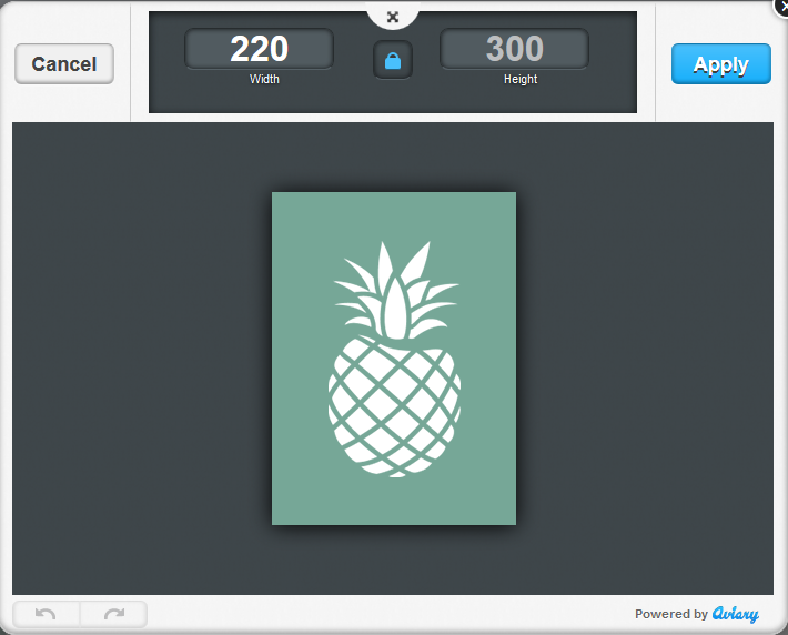
  3. Use the image editor to resize, enhance, or add text to the image
    1. Note: One advantage of resizing the image using this editing tool is that you can reduce the image size and the time it will take readers to download it.  Whereas if you only type in the width and height in the image properties window, the file size will remain the same.

    image2013-6-17 16-20-31

  4. When done making changes, click Apply, Save, Close, and OK

Contact eMail Networks Support at (866) 271-5908 with any questions.